Cascading Stylesheets (CSS)
References
Introduction
The currently accepted, most useful way of structuring and
formatting HTML pages is a
technology called
"Cascading Style Sheets", or CSS for short. The W3C
(World Wide Web
Consortium) first proposed CSS back in 1996, and CSS is now working in all
of the major browsers.
You can very precisely determine how you want your Web pages to look, with
CSS rules. You can control the appearance of text (fonts), position elements
(images and such) on the page, control backgrounds, and do all sorts of formatting
tricks that you can't do with HTML alone.
There are three
types, or flavors, of stylesheets. The
three types of stylesheets are inline, embedded, and external
stylesheets.
Stylesheets contain style rules. We will talk about a bunch
of different rules as we go through this class.
Now we come to the reasons why stylesheets are called "cascading" stylesheets.
-
The style rules from an external stylesheet are applied to the page first.
Then the rules from an embedded stylesheet are applied to the page.
Last, the rules from inline stylesheets are applied to the page.
-
The rules in an embedded stylesheet are added to the rules
in an external stylesheet. If any rules in the embedded stylesheet
conflict with rules in the external stylesheet, the rules in the
embedded stylesheet override the conflicting rules in the
external stylesheet.
-
The rules in inline stylesheets are added to the
rules in both an external stylesheet and an
embedded stylesheet. If any rules in the inline stylesheets
conflict with rules in the external or embedded stylesheets, the rules
in the inline stylesheets override the conflicting rules
in the external or embedded stylesheets.
This adding and overriding of rules is
one reason that we use the term "cascading" in describing stylesheets.
Additionally,
-
In most situations, any stylesheet rules that are applied to an HTML tag
which contains other HTML tags, "flow" or "cascade"
down to the nested
(contained) tags. The technical term for this cascading of rules is
"inheritance".
And this inheritance of rules by nested tags is another
reason that we describe stylesheets as "cascading".
Stylesheet Syntax
The basic syntax of CSS rules in
external and embedded
stylesheets is:
The basic syntax of CSS rules in inline stylesheets is:
style="property:value; property:value"
You should note these points about the syntax:
-
The external and embedded rules use a selector
to tell the browser what part of the page to apply the rules to. We will
talk about selectors in the paragraphs following this list.
-
The external and embedded rules have curly braces
around the property:value information.
-
The inline rules are made with an HTML attribute.
The attribute is style. The rules in an inline
stylesheet apply to the HTML tag that the style attribute
is in.
-
The inline rules have quotes around the
property:value information.
-
In both types of rules, there is a colon (:) between each property:value pair.
-
In both types of rules, multiple rules (technically called declarations) are
separated by a semi-colon (;).
Selector Combinators
The CSS specification includes several Selector Combinators that can be used to specify the relationship
between selectors.
Here is a summary of the combinators:
| Combinator Name |
Symbol |
Example |
Explanation |
| Child |
> |
div > p |
Selects every <p> element that are direct children of a <div> element |
| Descendant |
(single space) |
div p |
Selects all <p> elements inside <div> elements |
| Namespace separator |
| |
ns | h2 |
Selects all <h2> elements in namespace ns |
| Next-sibling |
+ |
div + p |
Selects the first <p> element that is placed immediately after <div> elements |
| Selector list |
, |
div, p |
Selects all <div> elements and all <p> elements |
| Subsequent-sibling |
~ |
p ~ ul |
Selects all <ul> elements that are preceded by a <p> element |
The selector in external and embedded stylesheets tells the browser
what you want to apply the rules/declarations to. A selector can be one of three
kinds:
-
-
As a reminder, HTML elements are tags such as the body, paragraph (p), div, and span tags.
-
An element selector name is simply the name of the HTML
tag that it will apply its rules to. For instance, if you want
to apply some rules to HTML paragraphs, your selector would
look like this in the stylesheet:
p
{
}
-
An element selector is used by the browser for every
such element in your page, unless you do something else to override
these rules (more on that later).
-
An element selector's rules are applied automatically by the
browser, simply by your having that HTML element in your page.
For instance, if you have a p selector in your (external
or embedded) stylesheet, the rule(s) associated with the p selector
will be applied to your paragraphs without your doing anything (else) to the paragraph tags
in your page (but see below for how you apply an external stylesheet
to your pages).
-
-
A class selector name (in the stylesheet itself)
starts with a period, like
this:
.normalText
{
}
-
You can name your class selectors almost anything, but your class
names must not have spaces in them.
-
A class selector's rules may be used multiple times in a page.
-
In the HTML page, a class selector is applied to an HTML
tag as a class attribute.
-
Here is an example of a class attribute (applied here to a paragraph tag):
<p class="normalText">
-
-
An id selector name (in the stylesheet itself)
starts with a pound sign, like
this:
#mainParagraph
{
}
-
You can name your id selectors almost anything, but your id
names must not have spaces in them.
-
In the HTML page, an id selector is applied to an HTML
tag as an id attribute.
-
Here is an example of an id attribute (applied here to a paragraph tag):
<p id="mainParagraph">
You should note these points about how class and id
rules are named and used:
-
The class and id names are case sensitive when the
DOCTYPE is XHTML 1.0 Transitional. They are even
case sensitive when the DOCTYPE
is HTML 4.01 Transitional in some browsers.
You should use all lowercase names
for consistency, to avoid problems, or at least be very
careful in naming your selectors.
-
The class and id names should be mutually exclusive, meaning that you
should not have any class names that are the same as any id names in your stylesheet.
Technically, you
can have a class and an id selector with the same name, but I don't
recommend it. You never know how it might mix up your
own brain cells.
| Note: |
Most stylesheet references and tutorials mention a variation on the
class selector that looks like this:
h3.headerModified {color:blue}This type of class selector is technically referred to as being
"bound to an element type" and is fairly common in the real
world. You may use this type of class selector as much and as
freely as you wish, but it can be limiting to an extent that you
may find frustrating, because any class selector that you bind can
only be used in that type of element. I prefer to use class
selectors that are
not bound, and which are called "free-range class selectors"
because I can use them in any tag that I want to.
|
Inline Stylesheets
An inline stylesheet's rules are applied as an attribute of the
HTML
element (tag) that you want them applied to. This type of stylesheet
can be applied to almost any HTML element, almost anywhere in your
page's body. An inline stylesheet's rules look like this:
<p style="color:blue;">This is some text in a paragraph.</p>
You should note that the color property in this example
refers to the color of the text that is contained by the
paragraph tag. We will see other uses of the color property
later.
One of the amazing and
interesting aspects of inline stylesheets is that
you can apply background colors to any part of your page without having
to put the elements you want to give a background color to, inside a
table as you would have to do with standard (non-CSS) HTML. For instance,
you can give even a single word a different background color
like this:
One of the <span style="background:yellow">amazing</span> and
interesting aspects of inline stylesheets...
Please note that the <span>...</span> tag is used a lot to apply CSS rules to
a page's content. The <span>...</span> tag was specifically designed by the W3C to enclose
small portions of content, and to apply style rules to that content. Also note that
a <span>...</span> tag does not add any linefeeds (line breaks) to the element/text
that it contains.
As noted above, the rules in inline stylesheets are added
to the rules in both an external stylesheet
and an embedded stylesheet.
If any rules in the inline stylesheets conflict with
rules in the external or embedded stylesheets, the rules in the
inline stylesheets
override the conflicting rules in the external or
embedded stylesheets.
Inline stylesheets are commonly used in these situations:
Embedded Stylesheets
An embedded stylesheet is located in the <head> section of
your Web page. Your <head> section might, for instance, look like
this:
  <head>
    <title>An embedded stylesheet sample</title>
    <style>
      body
      {
        font-family:Arial,Garamond;
        color:blue;
        font-size:1em;
      }
    </style>
  </head>
You should note these points about the above code:
-
The stylesheet is enclosed in <style>...</style> tags.
-
What looks like a set of HTML comments just inside
the <style>
and </style> tags above really are HTML comments to a
browser that doesn't understand the <style> tag, so the style
rules don't display on the page. But to a browser that does
understand the <style> tag, these comment markers are
ignored, and the rules are processed.
-
As noted above, the rules in an embedded stylesheet are
added to the rules in an external stylesheet. If any
rules in the embedded stylesheet conflict with rules
in the external stylesheet, the rules in the embedded stylesheet
override the conflicting rules in the external stylesheet.
-
Embedded stylesheets are commonly used in these situations:
-
To format an HTML file that is used as the signature to an e-mail message
in certain e-mail client programs such as Outlook and Lotus Notes.
-
To format an HTML e-mail message.
Here is an example of how an embedded stylesheet works in an
e-mail signature. This is file signature3.html:
<html>

<head>
<meta http-equiv=Content-Type content="text/html; charset=windows-1252">
<title>____________________________________________________</title>

<style>
  body {font-family: Arial, sans-serif;}
  .nameStuff {font-size:1em; font-weight:bold;}
  .companyStuff {font-size:1em;}
  .jobStuff {font-size:1em; font-weight:bold;}
</style>

</head>

<body lang=EN-US>

<div>

<hr>

<table cellspacing='0'>
 <tr>
  <td><img width="50%" src="images/DCLOGO_RGB_MASTER_MARK.jpg"></td>
 </tr>
 <tr>
  <td>
  <p><span class='nameStuff'>Jim Link</span>
     <br><span class='jobStuff'>Adjunct Faculty Instructor</span>
     <br><span class='companyStuff'><a href="mailto:jlink@dcccd.edu">jlink@dcccd.edu</a></span></p>
  </td>
 </tr>

  <tr>
	<td>
	  <p>
		 <span class='nameStuff'>Dallas College</span>
		 <br><span class='companyStuff'>Richland School of Creative Arts, Entertainment and Design</span>
		 <br><span class='companyStuff'>Multimedia Learning Center</span>
		 <br><span class='companyStuff'>12800 Abrams Rd</span>
		 <br><span class='companyStuff'>Dallas, TX  75243  USA</span>
	  </p>
	</td>
  </tr>
</table>
</div>

</body>

</html>
You can
see how this signature page looks
here.
External Stylesheets
Some books and references refer to this type of stylesheet as a
"Linked" stylesheet. As you will see in just a moment, the stylesheet
is indeed attached to the page with a <link> tag, but I will go with
the accepted
terminology of the CSS specifications and will refer to this type of
stylesheet as an external stylesheet.
This type of stylesheet is where the real power of CSS is applied to
your Web site. You can format an entire Web site with a single
stylesheet, as long as all of the pages in the Web site know where
to find the stylesheet (which we'll see in just a moment). If you
need to change the formatting of the site, you only have to change
this one stylesheet, upload it to your site, and voila! the whole
site reflects your change.
You make an external stylesheet by typing some style rules (declarations)
in a text
editor such as Notepad++. For instance, you could type
these rules into Notepad++:
  body
  {
    font-family:Arial,Garamond;
    color:blue;
    font-size:1em;
  }
and save these rules as file
myStyles.css, for example. The file
myStyles.css is now an
external stylesheet.
There are some restrictions on what can go into an external
stylesheet:
You should note carefully that the only things that can go into an external
stylesheet file are rules and comments . There should be no HTML tags.
This restriction means that you must not put a <style>...</style> tag
into an external stylesheet.
Please note that CSS comments start with /* and end with */ .
But now the pages in your site need to know where to
find the external stylesheet. You tell your pages how to find the
external stylesheet with a <link> tag in the
<head> section of each page that you want the
external stylesheet's
rules applied to.
Here is what the <link> tag (in the <head> section)
looks like:
You should note these points about the above code:
-
There is no closing link tag (</link>). It is a self-closing tag.
-
The rel attribute tells the browser that the linked-to
file is a stylesheet.
-
The type attribute tells the browser what kind of
file to expect. In this case, of course, it is a text file that
has CSS rules in it.
-
The media attribute tells the browser what is the intended
rendering (display) destination for the style sheet definitions. Multiple
destinations are possible, and are specified in a comma-delimited list.
The possible values of the media attribute are:
- all [DEFAULT] - Suitable for all devices.
- screen - Intended primarily for color computer screens.
- print - Intended for paged material and for documents viewed on screen
in print preview mode.
- handheld - Intended for handheld devices (typically small screen,
limited bandwidth).
- projection - Intended for projected presentations, for example projectors.
- braille - Intended for braille tactile feedback devices.
- embossed - Intended for paged braille printers.
- speech - Intended for speech synthesizers. Note: CSS2 had a
similar media type called 'aural' for this purpose.
- tty - Intended for media using a fixed-pitch character grid (such as
teletypes, terminals, or portable devices with limited display capabilities).
Authors should not use pixel units with the "tty" media type.
- tv - Intended for television-type devices (low resolution, color,
limited-scrollability screens, sound available).
One really interesting feature of the media attribute is that you
can have a separate stylesheet for each different rendering (display)
device. For instance, you could have separate stylesheets for screen
and print which display the page differently in the browser itself
and in the "Print Preview" display page.
-
The href attribute tells the browser where to find
the external stylesheet file. The value of this attribute can be
either a relative URL to the file, or an absolute URL
to the file.
-
An absolute URL includes a protocol specifier, a
server name, and a file name.
The standard protocol specifier for a URL is http://
and stands for Hypertext Transfer Protocol.
Technically, it tells the browser that you want to use the standard
communication scheme used on the Internet to transfer the messages
and files between the user's computer and the Web server computer.
The server name is the name of the Web server that contains the
page or file you are linking to. It actually gets translated into a
special series of numbers called an IP Address (Internet Protocol
Address), but you don't need to worry about that. The translation is
handled by a bunch of computers around the world called Domain Name
Servers (DNS). You just need to know the Web server name, such as
"www.rlc.dcccd.edu".
If, for instance, your stylesheet myStyles.css is on a server
called www.standardStyles.com, your <link> tag could look like this:
<link rel="stylesheet" type="text/css" media="all"
      href="http://www.standardStyles.com/myStyles.css" />
-
A relative URL refers to a file that is on the same server as the
file that is using the stylesheet. The relative URL
may include path (folder) information,
and must include a file name.
If the file you are linking to is in the same folder as the
file that contains the <link> tag, you just need to give the file name
in the href attribute. For example, if the file myStyles.css is in
the same folder (on the Web server) as the page that the <link> tag
is in, the href attribute will look like this:
<link rel="stylesheet" type="text/css" media="all" href="myStyles.css" />
If the file you are linking to is in a sub-folder underneath
the folder (on the Web server) that the current file is in, the href
attribute must include
the folder name (or folder
names) that lead(s) to the folder that the file you are linking to is in,
followed of course by the file name itself. Each folder in
the URL reference is separated from other folders and the file name
by a forward slash (/).
For instance, if the stylesheet myStyles.css is in a folder called
"Stylesheets" under the folder that our HTML page is in, the href
attribute would look like this:
<link rel="stylesheet" type="text/css" media="all" href="Stylesheets/myStyles.css" />
If the file that you are linking to is in a folder above
the current folder, you need to tell the browser to "back up" in the
folder structure. Each level that you want to "back up" is
represented in the href attribute with ../ and you can use
as many of these "back up" designators as you need, if you need
to back up more than one level in the folder structure.
For instance, if the stylesheet myStyles.css is in the top
folder of your site (often called the "root folder"), and
the page that is linking to the stylesheet is in a sub-folder under
the root folder, the href attribute would look like this:
<link rel="stylesheet" type="text/css" media="all" href="../myStyles.css" />
Div, Span, and P Tags with CSS
The <div>...</div>, <span>...</span>, and <p>...</p> tags
are among the most frequently used and handiest tags to use with CSS.
-
Stands for "division".
-
Contains many other content elements and tags, including other
div tags.
-
Extends across the entire available horizontal width of the display area, unless you do these things:
-
Change the width with a CSS width property; or
-
Change its position with a CSS position property; or
-
Both.
-
Stands for "paragraph".
-
Contains mainly text. It can also contain a few other tags, which
you will see later in the course.
-
Is a block display element.
-
Extends across the entire available horizontal width of the display area, unless you do these things:
-
Change the width with a CSS width property; or
-
Change its position with a CSS position property; or
-
Both.
-
Has two implied LFs before it, and two
more implied LFs
after it. These
LFs effectively put a blank line before and
after the paragraph.
Text Formatting
If you don't specify a font-family for your HTML document, the browser will
default to displaying Times New Roman. Most computers have this
font installed, which is the reason that it is used as the default
font.
Font Size
[Here is an excellent article
about the font-size property. I have used
some of the information from this article in the section below.]
Here is an example of how to specify the font size with a style
rule:
<span style="font-size:large;">This is some large text.</span>
and this is how it would look in a browser:
This is some large text.
The possible absolute font sizes that you can use are:
- xx-small
- x-small
- small
- medium
- large
- x-large
- xx-large
Please note that the above absolute font sizes are determined from a browser preset
and the element will not inherit its parent?s size. What this means in plain language is that
the above absolute font sizes use the browser's current default font size as the
starting size to modify, and that the modified text size will NOT be based on the current
font size of the element that you are modifying.
Medium is the default value for the font-size property and should be
equivalent to the current browser default size, in most browsers.
There are two relative/calculated font sizes that you can use, if you wish:
The modified font size value is
relative to the current font size of the parent element.
W3C Recommendation
You should note carefully that the W3C recommends that you not
specify the exact font size, meaning that you not use pixels or points
for your font size. The W3C recommends that you use relative
rather than absolute units in your font-size specifications.
The W3C's page for CSS Techniques for Web Content Accessibility Guidelines
has some really good information in the section "Units of Measure".
A quick summary of the W3C's guidelines follows:
-
Use em units to set font sizes. An em unit is (in most browsers) the height of the
upper-case M in the current font face/family.
-
In other situations where a length or size unit is needed, use relative
units, such as percentage units. (We will see more of this concept
in later classes.)
What this all boils down to is this: Use percentages or em units to
specify your font sizes, like this:
<span style="font-size:2em;">This is some text that is 2em units in size.</span>
which looks like this:
This is some text that is 2em units in size.
Or this:
<span style="font-size:150%;">This is some text that is 150% of the current font size in the browser.</span>
which looks like this:
This is some text that is 150% of the current font size in the browser.
Please note that:
-
If your font size is specified in em units, which the W3C definitely
recommends, the letters em follow the
size you want.
-
There is no space between the number and em.
rem Units
There is a great article at Font sizing with rem
which describes a lot of what this section is about.
The standard em unit has a potential problem: Because is it a compounded (multiplied) unit,
you can have a hard time keeping track of what the "current" (technically called "base") font size is.
The CSS3 specification added a new unit, rem, which stands for "root em unit".
When you use the rem unit as your font size, the number you specify is multiplied
times the em unit value for the <html> tag. The value of em for
the <html> tag is usually 12pt (about 16px, depending of course on the particular monitor being
used).
So, if you are setting the font size for a tag which is nested several levels deep in the tag structure
of your page, you can use the rem unit in your stylesheet to restore some sanity (somewhat)
to your font-size rules.
Font Family
You can tell the browser what font face to use, but
if the computer that the browser is running on doesn't have
the font face you're asking for, the browser will default
back to Times New Roman. Please note that the term
"face" in HTML is "family" in CSS.
Here is how you specify a font face/family (see the notes below regarding the two versions
of this example):
<span style="font-family: 'Courier New', Courier, monospace;">This is some text.</span>
or
<span style='font-family: "Courier New", Courier, monospace;'>This is some text.</span>
and it will display like this:
This is some text.
Here are some points regarding the font-family specification above:
- The font-family style rule's value can be a list
of font names.
- Each font name in the list is separated from the others by a comma.
- If any font name in the list has any spaces in the name, that family
name must be enclosed in quotes. The two versions of the example above
are different only in the type of quotes used. In the first example, the outer
quotes (those containing the entire style attribute's value) are double quotes,
and in the second example the outer quotes are single quotes. It doesn't matter
which type of quote you use, as long as the inner quotes (those around
the individual font family names) are of a different type than the outer
quotes.
- The browser will try to find the first font in the list. If
it cannot find the first font on the user's computer, the browser
will look for the second font, and so on.
- The last font family/name in the list should be one that you
are fairly sure will be found on the user's computer, as a sort
of default font. Some of the standard "default" fonts are:
- serif
- sans-serif
- monospace
- cursive
- fantasy
The above "default" fonts look like this:
- This is serif.
- This is sans-serif.
- This is monospace.
- This is cursive.
- This is fantasy.
Hexadecimal Colors
A hexadecimal color value uses this format:
#RRGGBB
where RR is the RED component of the
color, GG is the GREEN component, and
BB is the BLUE component. To turn one
of these components "off", use a hexadecimal value of 00. To
turn the component all the way "on", use a hexadecimal value
of FF. The other browser-safe values (33, 66, 99, and CC) give
in-between intensities for each color component.
An alternative format for hexadecimal colors uses this syntax:
#RGB
where R is the RED component of the
color, G is the GREEN component, and
B is the BLUE component. This format
is equivalent to using the #RRGGBB format where the two digits
for RR are identical to each other, the two digits for GG are identical
to each other, and the two digits for BB are identical to each other.
Please note that the color WHITE is the hex value #FFFFFF, and the
color BLACK is hex value #000000.
Here are some samples of colors:
-
This is the color #FF0000, which
can also be #F00. This is pure Red.
-
This is the color #00FF00, which
can also be #0F0. This is pure Green.
-
This is the color #0000FF, which
can also be #00F. This is pure Blue.
-
This is the color #FFFF00, which
can also be #FF0. This is Red + Green,
which is yellow.
-
This is the color #FF00FF, which
can also be #F0F. This is Red +
Blue, which is magenta (sometimes called fuschia or purple).
-
This is the color #00FFFF, which
can also be #0FF. This is Green +
Blue, which is cyan (sometimes called turquoise).
-
This is the color #999999, which
can also be #999. This is
equal amounts of Red, Green, and Blue; which always gives some shade
between black and white,
which means some shade of gray (if it is not pure black or pure white).
If you want to experiment with various color combinations, you can
look at these color design tools:
Color
You set the font color like this:
<span style="color:red">This is red text.</span>
or
<span style="color:#FF0000">This is #FF0000 (also red) text.</span>
and the above samples look like this:
This is red text.
This is #FF0000 (also red) text.
Please note that the CSS property for the font color is color. It is
NOT font-color.
Font Weight
The font-weight property tells the browser how thick, or dark, to make the font characters.
In the old days (like, before 1996!), you would use the <b>...</b> (bold) tag to make
a font "bold".
In CSS, here is a list of font-weight values that you can use:
- 100
- 200
- 300
- 400
- 500
- 600
- 700
- 800
- 900
But you can also use these two "toggle" values:
Please note: The "normal" value corresponds to the
numeric value of 400, and the "bold" value
corresponds to 700.
So, for instance, you can set your text to "bold" by using either of
these two formats:
<span style="font-weight:700;">This is bold text.</span>
or
<span style="font-weight:bold;">This is also bold text.</span>
and they look like this:
This is bold text.
This is also bold text.
The text-align Property
The text-align property is used to horizontally align text in the way
that you want. The default text alignment is at the left
side of the text's container element.
The (other) text-align values that you can use are:
- left
- center
- right
- justify
Here are some examples of how to use text-align:
First,
  <div style="text-align:center;">
    This is some text to demonstrate how the text-align property "center"
    works so we need to put in a bunch of words so the sentence stretches across
    to the right margin and wraps back to the left margin.
    This is some text to demonstrate how the text-align property "center"
    works so we need to put in a bunch of words so the sentence stretches across
    to the right margin and wraps back to the left margin.
    This is some text to demonstrate how the text-align property "center"
    works so we need to put in a bunch of words so the sentence stretches across
    to the right margin and wraps back to the left margin.
  </div>
displays the text like this:
This is some text to demonstrate how the text-align property "center"
works so we need to put in a bunch of words so the sentence stretches across
to the right margin and wraps back to the left margin.
This is some text to demonstrate how the text-align property "center"
works so we need to put in a bunch of words so the sentence stretches across
to the right margin and wraps back to the left margin.
This is some text to demonstrate how the text-align property "center"
works so we need to put in a bunch of words so the sentence stretches across
to the right margin and wraps back to the left margin.
Second,
  <div style="text-align:right;">
    This is some text to demonstrate how the text-align property "right"
    works so we need to put in a bunch of words so the sentence stretches across
    to the right margin and wraps back to the left margin.
    This is some text to demonstrate how the text-align property "right"
    works so we need to put in a bunch of words so the sentence stretches across
    to the right margin and wraps back to the left margin.
    This is some text to demonstrate how the text-align property "right"
    works so we need to put in a bunch of words so the sentence stretches across
    to the right margin and wraps back to the left margin.
  </div>
displays the text like this:
This is some text to demonstrate how the text-align property "right"
works so we need to put in a bunch of words so the sentence stretches across
to the right margin and wraps back to the left margin.
This is some text to demonstrate how the text-align property "right"
works so we need to put in a bunch of words so the sentence stretches across
to the right margin and wraps back to the left margin.
This is some text to demonstrate how the text-align property "right"
works so we need to put in a bunch of words so the sentence stretches across
to the right margin and wraps back to the left margin.
And third,
  <div style="text-align:justify;">
    This is some text to demonstrate how the text-align property "justify"
    works so we need to put in a bunch of words so the sentence stretches across
    to the right margin and wraps back to the left margin.
    This is some text to demonstrate how the text-align property "justify"
    works so we need to put in a bunch of words so the sentence stretches across
    to the right margin and wraps back to the left margin.
    This is some text to demonstrate how the text-align property "justify"
    works so we need to put in a bunch of words so the sentence stretches across
    to the right margin and wraps back to the left margin.
  </div>
displays the text like this:
This is some text to demonstrate how the text-align property "justify"
works so we need to put in a bunch of words so the sentence stretches across
to the right margin and wraps back to the left margin.
This is some text to demonstrate how the text-align property "justify"
works so we need to put in a bunch of words so the sentence stretches across
to the right margin and wraps back to the left margin.
This is some text to demonstrate how the text-align property "justify"
works so we need to put in a bunch of words so the sentence stretches across
to the right margin and wraps back to the left margin.
Notice that both the left and right margins are straight and even, when you
use the "justify" value.
Warning of a Missing Stylesheet
Occasionally, a browser will receive the HTML page from the Web server, but will not also
receive the external stylesheet. This situation leaves the HTML page displayed in
the browser with only the browser's default formatting (black 12pt 'Times New Roman' font, with a
body background color of white).
The user of the browser can refresh or reload the HTML page in an attempt
to get the stylesheet from the Web server along with the HTML page. This approach is,
in fact, the best way to remedy this very occasional situation.
The following code is just one way to suggest to the user that they should reload the page.
Please keep in mind that there are usually multiple ways
to accomplish a task in an HTML page! This is just one suggestion.
Here is the sample HTML page,
MissingStylesheetExample.html:
Here is the same sample page, but with the stylesheet's
name in the href attribute
purposely misnamed so the browser does not receive the stylesheet.
Now let's look at the sample HTML page and its stylesheet:
<!DOCTYPE html>
<html>
<head>
  <meta charset="UTF-8">
  <title>Sample HTML Page</title>
  <link rel="stylesheet" type="text/css" href="MissingStylesheet.css" />
  </style>
</head>

<body>
  <div id="MissingWarning"
       style="width: 800px;
              margin: 0 auto;
              color: #A33;
              font-size: 2em;
              font-family: Arial, sans-serif;
              border: 5px solid #A33;
              border-radius: 3em;
              background-color: #FFC;
              padding: 10px;">
    Please reload this Web page.  The stylesheet is missing.
  </div>
  <div id="mainDiv">
    <h3>
      This is a sample HTML page.
    </h3>
    <p id="firstParagraph" style="display: none;">
      The stylesheet has been found and processed.
    </p>
  </div>
</body>
</body>
</html>
Here is the stylesheet, MissingStylesheet.css:
body
{
  font-family: Arial, sans-serif;
}

#mainDiv
{
  width: 800px;
  height: 460px;
  border-radius: 2em;
  text-align: center;
  margin: 0 auto;  /* TB   LR  */
  border: 3px solid gray;
}

#MissingWarning
{
  display: none;
}

#firstParagraph
{
  display: block !important;
}
Please note these points about the above code:
The !important Property
The !important property which I mentioned above, needs just a bit more explanation...
The !important property in CSS is used to add more importance to a property/value.
Please note: Do not use the !important property unless you absolutely have to. It is considered an option of last resort. But if
you do need it, go ahead and use it!
Contextual Selectors
Sometimes you need to limit the places where the browser applies your style
rules. One way to do this limiting is to use what are called contextual
selectors. A contextual selector is one that the browser applies
in the context of another, specified selector.
For example:
  .first P { color: red }
  .second P { color: blue }
Contextual selectors consist of several simple selectors separated by whitespace.
Only elements that match the last simple selector (in this case the 'P' tag)
are affected, and only if the search pattern matches. In simple English, what this
means is that when a page uses the selectors shown above,
content that is contained by a P tag will be red,
but only if the P tag is contained by a tag that has a
.first class attribute
in it; and the content will be blue, but only if
the P tag is contained by a
tag that has a .second class attribute
in it.
The following example shows how the selectors shown above can be used. You can
see the sample page here.
This is page contextualSelector.html:
<!DOCTYPE html PUBLIC "-//W3C//DTD XHTML 1.0 Transitional//EN"
   "http://www.w3.org/TR/xhtml1/DTD/xhtml1-transitional.dtd">
<html xmlns="http://www.w3.org/1999/xhtml" xml:lang="en" lang="en">

<head>
  <title>Contextual Selector Example</title>
  <meta http-equiv="content-type" content="text/html;charset=utf-8" />
  <meta http-equiv="Content-Style-Type" content="text/css" />
  <link rel="stylesheet" type="text/css" media="all" href="contextualSelector.css" />
</head>

<body>
  <div class="first">
    <p>
      This is the first paragraph.
    </p>
  </div>
  <div class="second">
    <p>
      This is the second paragraph.
    </p>
  </div>
</body>
</html>
This is page contextualSelector.css:
/* Contextual Selectors */

.first P { color: red }

.second P { color: blue }
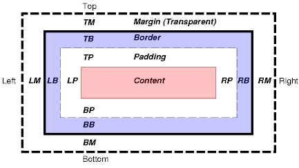
The CSS Box Model
The CSS box model describes the rectangular boxes that are generated for tags/elements in
the page, and which are laid out according to the visual formatting model. The W3C has a
fairly good explanation
of this box model. The W3Schools site also has a good explanation. I will borrow from both here.
Each box has a content area (e.g., text, an image, etc.) and optional surrounding
padding, border, and margin areas. The size of each area is specified by properties
such as border, padding, and margin; quite naturally; in elements such as <div>,
<p>, and <span>.
The following diagram shows how these areas relate
and the terminology used to refer to pieces of margin, border, and padding:
The margin, border, and padding can be broken down into left, right, top, and bottom
segments (e.g., in the diagram, "LM" for left margin, "RP" for right padding, "TB"
for top border, etc.).
The perimeter of each of the four areas (content, padding, border, and margin) is
called an "edge", so each box has four edges:
-
content edge or inner edge
The content edge surrounds the element's rendered content.
-
padding edge
The padding edge surrounds the box padding. If the padding has 0 width, the padding
edge is the same as the content edge. The padding edge of a box defines the
edges of the containing block established by the box.
-
border edge
The border edge surrounds the box's border. If the border has 0 width, the border
edge is the same as the padding edge.
-
margin edge or outer edge
The margin edge surrounds the box margin. If the margin has 0 width, the margin
edge is the same as the border edge.
Each edge may be broken down into a left, right, top, and bottom edge.
The dimensions of the content area of a box -- the content width
and content height --
depend on several factors: whether the element generating the box has the
'width' or 'height' property set, whether the box contains text or other
boxes, whether the box is a table, etc.
The box width is given by the sum of the left and right margins, border, and padding,
and the content width. The height is given by the sum of the top and bottom
margins, border, and padding, and the content height.
The background style of the various areas of a box are determined as follows:
-
Content area: The 'background' property of the generating element.
-
Padding area: The 'background' property of the generating element.
-
Border area: The border properties of the generating element.
-
Margin area: Margins are always transparent.
Box Sizing
As of the Spring 2017 semester, the
browsers appear to be consistently applying
the default box-sizing property value (which is content-box) to
tags which have width, height, border, and padding properties.
Before the Spring 2017 semester, the various browsers handled
the box-sizing property differently, with most of the browsers apparently treating
the default value as border-box. But the situation has pretty much completely changed now.
What this new situation means for us is that tags which
have width and height CSS properties, plus non-zero border
and/or padding properties, will behave in a sensible and predictable way only if you
explicitly set the box-sizing property's value to border-box.
By default (meaning that the box-sizing property's value is content-box), the displayed size of
a tag which has width and height CSS
properties, also includes the size (width) of the border and padding
properties. This means that the displayed size of the tag will be larger
than the width and height settings if the tag also has non-zero border
and/or padding properties. This default behavior is not at all what
most of us expect.
Again, what this means for us is that we need to explicitly
set the box-sizing property's
value to border-box in order to see the size that
we expect for the tag.
To be even more specific, in order to make tag(s) which have non-zero border and/or padding
properties display at the size that we set with the width and
height properties, we need to also apply this rule to the
tag(s):
box-sizing: border-box;
Here is a page which shows some of the differences
between the content-box (default) and border-box box-sizing values.
Many designers are now adding some style properties to their stylesheets to set border-box as the
box-sizing property's value for all of the content in their pages. One way to accomplish
this setting is to add these selectors and rules to your stylesheet:
html
{
  box-sizing: border-box;
}

*, *:before, *:after
{
  box-sizing: inherit;
}
Please note that if you do add the previous rules to your stylesheet, you probably will not need to
add any more box-sizing properties to your stylesheet. These two box-sizing rules should
apply to all of the tags in the page.
Centering
Horizontal centering is accomplished with the CSS margin property.
The element (tag) being centered also needs to have a specified width property.
Here is some very simple sample code
which shows how to horizontally center a <div> tag:
<!DOCTYPE html>
<html>
<head>
<meta charset="UTF-8">
<title>Centering</title>
<style type="text/css">
#mainDiv
{
width: 600px;
/* syntax: TB LR */
font-family: Arial, sans-serif;
border: 1px solid gray;
border-radius: 10px;
padding: 10px;
}
</style>
</head>
<body>
<div id="mainDiv">
<p>
Lorem ipsum dolor sit amet, consectetur adipiscing elit. Fusce fermentum, ligula non condimentum
viverra, lorem elit gravida diam, non venenatis quam tortor eu tortor. Nunc mollis eros ut pharetra
finibus. Mauris hendrerit, augue vitae semper congue, augue arcu iaculis mauris, quis lacinia nunc
lectus quis ante. Aenean aliquam finibus velit.
</p>
</div>
</body>
</html>
Please note these points about the above code:
-
The <div> tag, which is the tag being horizontally centered, has two CSS properties which are required
in order to make the horizontal centering work:
- width
- margin
-
More specifically, the margin property has left and right values of auto.
-
The auto margin values tell the browser to set the left and right margins to equal amounts. This
causes the browser to calculate the same left and right spacing values, which is how the <div> tag is horizontally
centered.
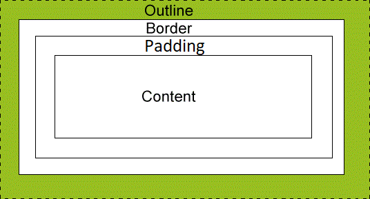
CSS Outlines
An outline is a line that is drawn around elements (outside the borders) to make the element "stand out".
The outline properties specify the style, color, and width of an outline.
However, the outline property is different from the border property.
The outline is not a part of an element's dimensions; the element's total width and
height is not affected by the width of the outline.
Interestingly, the outline is even independent of the margin.
-
If the margin is larger than the outline, the entire outline is shown outside the border
as usual,
with some empty space (the excess margin) outside the outline.
-
If the margin is smaller than the outline, the outline that is in excess of the margin
size, is cut off.
The following diagram, taken from the W3Schools site, shows how the outline relates
to the other parts such as the border:
And now following is a page which illustrates the difference between the border and the
outline.
While you are looking at the following page, please note these items:
-
In the top part of the page, are some <div> tags with outlines that show up when
you hover your mouse cursor over the <div>s.
-
In the bottom part of the page, are some other <div> tags with borders that show up
when you hover your mouse cursor over them.
-
The 15-pixel outlines on the top <div>s are thicker than the 7-pixel top margins. The
outlines overlay the margins, and go outside the margins.
-
The outline at the very top of the page even goes outside the margin of the body.
You can see how this page looks here.
This is page TestCSSOutline.html:
<!DOCTYPE html>
<html>
<head>
  <meta charset="UTF-8">
  <title>CSS Outlines</title>
  <link rel="stylesheet" href="OutlineStyles.css">
<!--[if lt IE 9]>
<script src="dist/html5shiv.js"></script>
<![endif]-->
</head>

<body>
	<div id="mainDiv" class="divStuff">
	  <h3>CSS Outlines</h3>
	</div>

	<div id="secondDiv" class="divStuff">
		<h3>Outlines do not affect the size of the box.  Note how the boxes do not shift
			when the outlines become visible.
		</h3>
	</div>

	<div id="versus">
		<h5>vs.</h5>
	</div>

	<div id="thirdDiv" class="divStuff">
	  <h3>CSS Borders</h3>
	</div>

	<div id="fourthDiv" class="divStuff">
		<h3>Borders do affect the size of the box.  Note how the boxes shift when the borders become
			visible.
		</h3>
	</div>
</body>
</html>
Here is the stylesheet, OutlineStyles.css:
/* Stylesheet for Experimenting */

body {
	font-family: Arial, sans-serif;
	font-size: 1.2em;
}

.divStuff {
	width: 500px;
	margin: 0 auto;
	border: 1px solid gray;
	border-radius: 10px;
	padding: 10px;
	margin-top: 7px;
}

#versus {
	width: 500px;
	margin: 0 auto;
	padding: 10px;
	margin-top: 7px;
}

#mainDiv:hover, #secondDiv:hover {
	outline: 15px solid blue;
	border-radius: 0px !important;
}

#thirdDiv:hover, #fourthDiv:hover {
	border: 15px solid blue;
	border-radius: 0px !important;
}
CSS3 Goodies
With the introduction of the CSS3 specification, the W3C had provided many new and improved features of CSS.
You can see a list of most of these features in this page of CSS3 features.