CSS Positioning
References
CSS Positioning in a Nutshell
When this class is over, you will be in good shape if you understand these concepts
which will be explained in detail in the rest of this eHandout:
-
The term "Positioning Context" refers to the bounding edges of the rectangle from which you are making your adjustments, using the CSS positioning rules. The positioning
context is an element which contains the tag that you are positioning. But please note: The default positioning context is the body of your page.
-
Absolute positioning is the most common kind of CSS positioning.
-
Relative positioning, when it is used, is usually used to make small adjustments to the position of a tag.
-
But you can also use relative positioning to establish different (meaning: other than the default) starting edges for absolute positioning.
For example, you can use relative postioning for your main <div> tag to create
a standard-sized, "floating" Web page. We will see details later in this class.
-
When you absolutely position a block display element, such as a
<div> or a <p> tag, the element's default width (which
is the entire
available horizontal display width in the browser) collapses.
You will probably need
to specify at least a width: property in the stylesheet, and
maybe even a height: property for the positioned tag,
to compensate for this
behavior.
-
Jim's Philosophy of Positioning:
-
If you absolutely position an element in your page, or in a particular
positioning context in the page, you will probably also need to absolutely position everything else in that
positioning context.
-
But in a Responsive Web Design (RWD) world, this philosophy can be substantially modified. In a RWD page,
the positioning context will probably be limited to a particular <div> tag or even to a
single <img> tag (see the Absolute Positioning example below).
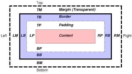
Review: The CSS Box Model
The CSS box model describes the rectangular boxes that are generated for (around) tags/elements in
the page, and which are created by the browser. The W3C has a
fairly good explanation
of this box model. The W3Schools site also has a good explanation. I will borrow from both here.
Each tag has a content area (e.g., text, an image, etc.) and surrounding
padding, border, and margin areas. The size (width) of each area is specified by CSS properties
such as (no surprise here!) padding, border, and margin.
The following diagram shows how these areas relate
and the terminology used to refer to pieces of margin, border, and padding:
The margin, border, and padding can be broken down into left, right, top, and bottom
segments (e.g., in the diagram, "LM" for left margin, "RP" for right padding, "TB"
for top border, etc.).
The perimeter of each of the four areas (content, padding, border, and margin) is
called an "edge", so each tag has four edges:
-
content edge or inner edge
The content edge surrounds the element's rendered content.
-
padding edge
The padding edge surrounds the box padding. If the padding has 0 width, the padding
edge is the same as the content edge. The padding edge of a box defines the
edges of the containing block established by the box.
-
border edge
The border edge surrounds the box's border. If the border has 0 width, the border
edge is the same as the padding edge.
-
margin edge or outer edge
The margin edge surrounds the box margin. If the margin has 0 width, the margin
edge is the same as the border edge.
Each edge may be further specified as left, right, top, and bottom properties.
The dimensions of the content area of a box -- the content width
and content height --
depend on several factors: whether the element generating the box has the
'width' or 'height' property set, whether the box contains text or other
boxes, whether the box is a table, etc.
The box width is normally computed (by the browser) as the sum of the left and right margins, border, and padding,
and the content width. The height is given by the sum of the top and bottom
margins, border, and padding, and the content height. (But see the following section for more recent developments regarding the property box-sizing.)
The background style of the various areas of a box are determined as follows:
-
Content area: The 'background' property of the tag.
-
Padding area: The 'background' property of the tag.
-
Border area: The border properties of the tag.
-
Margin area: Margins are always transparent.
Advanced Topic: Box Sizing
As of the Spring 2017 semester, the
browsers appear to be consistently applying
the default box-sizing property value (which is content-box) to
tags which have width, height, border, and padding properties.
Before the Spring 2017 semester, the various browsers handled
the box-sizing property differently, with most of the browsers apparently treating
the default value as border-box. But the situation has pretty much completely changed now.
What this new situation means for us is that the default setting for box-sizing is now content-box.
So tags which
have width and height CSS properties, plus non-zero border
and/or non-zero padding properties, will behave in a sensible and predictable way only if you
explicitly set the box-sizing property's value to border-box.
By default (meaning that the box-sizing property's default value is content-box), the displayed size of
a tag which has width and height CSS
properties, is increased by the size (width) of the border and padding
properties. This means that the displayed size of the tag will be larger
than the width and height settings if the tag also has non-zero border
and/or non-zero padding properties. This default behavior is not at all what
most of us expect.
Again, what this means for us is that we need to explicitly
set the box-sizing property's
value to border-box in order to see the size that
we expect for the tag.
To be even more specific, in order to make tag(s) which have non-zero border and/or non-zero padding
properties display at the size that we set with the width and
height properties, we need to also apply this rule to the
tag(s):
box-sizing: border-box;
Here is a page which shows some of the differences
between the content-box (default) and border-box box-sizing values.
Many designers are now adding some style properties to their stylesheets to set border-box as the
box-sizing property's value for all of the content in their pages. One way to accomplish
this setting is to add these selectors and rules to your stylesheet:
html
{
  box-sizing: border-box;
}

*, *:before, *:after
{
  box-sizing: inherit;
}
Please note that if you do add the rules shown above to your stylesheet, you probably will not need to
add any more box-sizing properties to your stylesheet. These two box-sizing rules should
apply to all of the tags in the page.
Review: Centering
Horizontal centering is accomplished with the CSS margin property.
The element (tag) being centered also needs to have a specified width property.
Here is some very simple sample code
which shows how to horizontally center a <div> tag:
<!DOCTYPE html>
<html>
<head>
<meta charset="UTF-8">
<title>Centering</title>
<style type="text/css">
#mainDiv
{
width: 600px;
/* syntax: TB LR */
font-family: Arial, sans-serif;
border: 1px solid gray;
border-radius: 10px;
padding: 10px;
}
</style>
</head>
<body>
<div id="mainDiv">
<p>
Lorem ipsum dolor sit amet, consectetur adipiscing elit. Fusce fermentum, ligula non condimentum
viverra, lorem elit gravida diam, non venenatis quam tortor eu tortor. Nunc mollis eros ut pharetra
finibus. Mauris hendrerit, augue vitae semper congue, augue arcu iaculis mauris, quis lacinia nunc
lectus quis ante. Aenean aliquam finibus velit.
</p>
</div>
</body>
</html>
Please note these points about the above code:
-
The <div> tag, which is the tag being horizontally centered, has two CSS properties which are required
in order to make the horizontal centering work:
- width
- margin
-
More specifically, the margin property has left and right values of auto.
-
The auto margin values tell the browser to set the left and right margins to equal amounts. This
causes the browser to calculate the same left and right spacing values, which is how the <div> tag is horizontally
centered.
Basic Syntax for Positioning Rules
CSS style rules can be used to position HTML elements
on the page. The main style rule properties that are used for CSS
positioning are:
- position
- top
- right
- bottom
- left
The basic format of a style rule that positions an HTML element on the page is
like this:
or
In the examples above, the left and top properties tell the browser how far (in pixels) to
move the element from the left and top edges, respectively,
of the positioning context that the positioned element is in.
So the left property tells the
browser how far to move the positioned element from the left edge of the
element's container; and the top property tells the browser how far to
move the positioned element from the top edge of the element's container.
A positive value for left moves the element to the right of,
and a negative value moves the element to the left of, the
positioning context.
A positive value for top moves the element down from, and a
negative value moves the element up from, the positioning context.
The positioning context that the browser uses for the positioned element
depends on whether the position property is
absolute or relative.
Positioning Context

-
For absolute positioning, the default positioning context is
the entire display area of the browser window, shown by the red
border in the image at the
left.
Here is an additional, and very important point: The element that is
absolutely positioned is removed (logically) from the
normal content flow of the page, and the other elements "close up"
the gap where the positioned element would have been displayed in the page.
-
For relative positioning, the default positioning context is
the position in the document (page) where the element would have
been if it had not been positioned.
Another way to say the same thing is that for relative positioning,
the default positioning context consists of the edges of the "box"
which contains the element in its
default/current location in the display.
In the image at the left, I have
shown two <div> tags in the document's body. Those black lines
are the edges of the relative positioning context for each of the <div> tags.
For relative positioning, the other elements on the page stay in their
normal positions, even though the positioned element has been moved away from
its (original) display position in the page.
-
The red arrows in the image above
show the direction of the offset for top, right, bottom, and
left properties which have positive values. (These same properties with
negative values would offset the relevant edges in the opposite direction.)
Basic Positioning Sample Pages
Here are some basic positioning sample
pages. (Be sure to click on the "Next Page" and "Previous Page" links on these
three pages.)
You can right-click in both of these pages to see the HTML code.
Absolute Positioning Sample with Image
Each time an element is positioned (either relative or
absolute positioning),
it establishes a new positioning
context for any other elements that the positioned element
contains. So, if we have another element (say, a paragraph)
that is contained by
a <div> tag that we position, and we also absolutely
position the contained paragraph
element, the contained positioned element's positioning
context is where
we positioned the <div> to.
Here is a simple example of absolute positioning within a new (not
default) positioning context, with TEXT overlaid on an IMAGE:
<!DOCTYPE html>
<html>
<head>
  <meta charset="UTF-8">
  <title>CSS Positioning Sample 5</title>
  <style type="text/css">
    body
    {
      font-family: Arial, sans-serif;
      font-weight: bold;
      color: blue;
    }

    #meterImageDiv
    {
      position: relative;
    }
    #PAImpedance
    {
      position: absolute;
      left: 230px;
      top: 213px;
    }
    #CoupTransPosition
    {
      position: absolute;
      left: 140px;
      top: 370px;
    }
  </style>
</head>

<body>
  <div id="mainDiv">
    <p>
      This image has numbers positioned over it...
    </p>
    <div id="meterImageDiv">
      <img src="images/ATUTuningImpedance.png">
      <span id="PAImpedance">19.96 Ω</span>
      <span id="CoupTransPosition">49 °</span>
    </div>
  </div>
</body>
</html>
The sample above can be seen in
action here.
Floating Positioning Context
With relative positioning, an element is offset from the place in the
document where it would have normally displayed, but all other elements remain in
their normal locations, without closing up the place where the
relative-positioned element was. But a relative-positioned element
does establish a new positioning context which may be used to
position other elements.
Relative positioning can be used to establish a new positioning context inside
a "floating div", which can be one approach to keeping your page's contents
in the middle of the display screen, using CSS
rules.
Following is the code for page floatingPosContext5.html:
<!DOCTYPE html>
<html>
<head>
  <meta charset="UTF-8">
  <title>Floating Positioning Context</title>
  <link rel="stylesheet" type="text/css" media="all" href="floatingPosContext5.css" />
</head>

<body>
  <div id="contentDiv">
    <p id="mainPara">
      Floating Positioning Context
    </p>
    <ol id="mainList">
      <li>Assignment 1</li>
      <li>Assignment 2</li>
      <li>Assignment 3</li>
      <li>Assignment 4</li>
    </ol>
    <img src="crazyeyes2.gif" id="crazyeyes" width="45" height="45" alt="Crazy Eyes" />
    <footer>
      © 2016 by Jim Link. All rights reserved.
    </footer>
  </div>
</body>
</html>
Here is the stylesheet, floatingPosContext5.css:
/* Test a Floating Positioning Context */
body
{
  font-family: Arial, sans-serif;
}

#contentDiv
{
  width: 760px;
  height: 460px;
  position: relative;
  margin: 0 auto;
  background-color: #FFCCFF;
}

#mainPara
{
  position: absolute;
  left: 100px;
  top: 80px;
}

#mainList
{
  position: absolute;
  left: 80px;
  top: 140px;
}

#crazyeyes
{
  position: absolute;
  left: 100px;
  top: 270px;
}

footer
{
  width: 280px;
  position: absolute;
  bottom: 1em;
  left: 50%;
  margin-left: -140px;
}
You can see how the contents
float with the browser's size here.
Please note these points about the above code:
-
The pink div is relatively positioned.
- The paragraph, the list, the image, and the footer are absolutely positioned
inside (in the positioning context of) the pink div tag.
-
The <footer> tag has a bottom positioning property in the stylesheet.
This property is very handy for placing items such as footers and alternative
text menus at the bottom of the positioning context.
Summary of Positioning Rules
It is now time to summarize the rules that we have discussed so far in this
handout. Basically, there are seven rules that you need to understand. The
first four rules are given in this table:
|
Type of Positioning
|
Positioning Context
|
What happens to elements that are not positioned
|
|
Absolute
|
1. By default: the edges of the main display area of the browser. It can be
changed to be the edges of a tag which is positioned and which contains
the absolutely-positioned element.
|
2. They move up and over to fill in where the positioned element was.
|
|
Relative
|
3. The edges of the positioned tag's current/original position in the browser display.
|
4. They stay in place; there is no movement.
|
The next three rules are:
A Three-Column CSS Positioning Example
Now it's time to look at a simple example of CSS positioning in a full Web
page. This example will show you how to position three blocks of text in the page
in order to simulate a three-column magazine or newspaper page.
But please NOTE: In a Responsive Web Design (RWD) world, this three-column arrangement is probably
better done with three RWD containers instead of using CSS positioning.
The sample page can be seen
here.
The HTML page is simplePosExample.html:
<!DOCTYPE html>
<html>
<head>
  <meta charset="UTF-8">
  <title>A Simple CSS Positioning Example</title>
  <link rel="stylesheet" type="text/css" href="simplePosExample.css" />
</head>

<body>
  <div id="mainDiv">
    <div id="MissingWarning">
      <p style="background-color: red; color: yellow;">
        Please reload this Web page.  The stylesheet is missing.
      </p>
    </div>
    <div id="firstDiv">
      <p>
         Lorem ipsum <strong>column one</strong>
         dolor sit amet, consectetuer adipiscing elit. Suspendisse blandit, metus quis
         congue scelerisque, risus sem lacinia orci, ultricies ornare leo nibh a dolor. Curabitur
         eget magna id velit pulvinar convallis. Vivamus ut lacus. Donec mauris massa, venenatis
         aliquet, varius ut, tincidunt vel, neque. Pellentesque bibendum auctor orci. Morbi risus.
         Integer eget magna vel lorem facilisis vehicula. Pellentesque eros est, dignissim id,
         volutpat in, vehicula volutpat, lorem. Fusce venenatis sem non mauris. Maecenas sit amet
         magna. Vestibulum semper scelerisque diam. Sed ultricies, tortor sed tincidunt placerat,
         est leo aliquet odio, non tincidunt est turpis nec dui. Etiam iaculis mollis tellus.
      </p>
    </div>

    <div id="secondDiv">
      <p>
         Lorem ipsum <strong>column two</strong>
         dolor sit amet, consectetuer adipiscing elit. Phasellus lacus. Maecenas a
         nibh. Nulla ornare libero a velit. Cras eu erat. Donec hendrerit vulputate pede. Cras
         fringilla tincidunt mi. Etiam euismod. Donec leo ante, posuere vitae, aliquet id, sagittis
         id, eros. Fusce a ante. Cras quis sapien. In aliquam leo quis est. Maecenas tincidunt,
         nulla ut posuere suscipit, erat ipsum congue mi, nec condimentum tellus ligula id orci.
         Quisque orci felis, malesuada nec, euismod sit amet, feugiat sed, magna. Sed commodo.
         Phasellus blandit erat. Sed blandit faucibus libero. Praesent at pede. Nam euismod dapibus
         justo. Aliquam ipsum est, facilisis a.
      </p>
    </div>

    <div id="thirdDiv">
      <p>
         Lorem ipsum <strong>column three</strong>
         dolor sit amet, consectetuer adipiscing elit. Nulla volutpat mi porttitor eros.
         Ut accumsan facilisis nibh. Sed nec arcu. Nam lacinia sollicitudin nibh. Pellentesque elit
         ipsum, blandit vitae, iaculis quis, malesuada vel, nulla. Quisque porta justo quis quam.
         Sed tincidunt ipsum ut mi. Vestibulum consectetuer. Nulla eu nunc consequat lectus porttitor
         pellentesque. Praesent congue dapibus quam. Morbi quam.
         Maecenas sit amet diam ac risus adipiscing lacinia. Sed vestibulum sem vitae dolor. Vivamus id
         metus. Pellentesque consectetuer convallis massa. Nullam rhoncus est. Etiam pretium. Sed blandit
         nulla in lacus. Donec vitae tellus in turpis dapibus tincidunt. Sed scelerisque orci sit.
      </p>
    </div>
  </div>
</body>
</html>
The stylesheet is simplePosExample.css:
/* Simple CSS Positioning Sample */

body
{
  font-family:Arial, Helvetica, sans-serif;
  text-align: justify;
}

#mainDiv
{
  width: 930px;
  height: 500px;
  margin: 0 auto;
  position: relative;
  border: 1px solid grey;
}

#MissingWarning
{
  display: none;
}

#firstDiv
{
  width: 280px;
  position: absolute;
  left: 15px;
  top: 20px;
}

#secondDiv
{
  width: 280px;
  position: absolute;
  left: 325px;
  top: 20px;
}

#thirdDiv
{
  width: 280px;
  position: absolute;
  left: 635px;
  top: 20px;
}
Please note these points about the above sample code:
- Each div section has a paragraph in it. The paragraph is not necessary
but is commonly used to contain text even if there is already a div tag in the
page.
- Each <div> tag has an id attribute in it.
- The id attributes connect the <div> tags to the id
selectors in the stylesheet.
- Each id selector in the stylesheet is used to give a specific
width to each div section.
- Each id selector also gives an absolute position for the
div section that uses that selector.
- The left and top properties take into account that the browser
by default puts into the page about 15 pixels of margin at the left, and about 20
pixels of margin at the top. The values that this sample page uses, position the
divs about where they would have been without the positioning, at least regarding
the margins at the left and top.
-
The total width of the divs and the gaps is 915 pixels. This width was purposely
designed into the column widths to allow the content to fit into a site that
expects the user's computer to be using a 1024x768 pixel screen resolution. The maximum
useful size for such a page is 960x560 pixels, to account for tabs, menus, icons,
status bar, and scrollbars in the browser.
-
If you were designing this page to fit into an 800x600 pixel screen resolution, the
maximum useful size is 760x460 pixels.
[Optional Section]
CSS Outlines
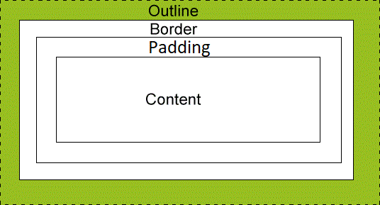
An outline is a line that is drawn around elements (outside the borders) to make the element "stand out".
The outline properties specify the style, color, and width of an outline.
Note: The outline property is different than the border property.
The outline is drawn
outside the element's border, and may overlap other content.
Also, the outline is not a part of the element's dimensions;
the element's total width and height is not affected by
the width of the outline.
And unlike borders, outlines won't allow us to set each edge to a different width,
or set different colors and styles for each edge.
An outline is the same on all sides.
The following diagram, taken from the W3Schools site, shows how the outline relates
to the other parts such as the border:
And now following is a page which illustrates the difference between the border and the
outline.
While you are looking at the following page, please note these items:
-
In the top part of the page, are some <div> tags with outlines that show up when
you hover your mouse cursor over the <div>s.
-
In the bottom part of the page, are some other <div> tags with borders that show up
when you hover your mouse cursor over them.
-
The 15-pixel outlines on the top <div>s are thicker than the 7-pixel top margins. The
outlines overlay the margins, and go outside the margins.
-
The outline at the very top of the page even goes outside the margin of the body.
You can see how this page looks here.
This is page TestCSSOutline.html:
<!DOCTYPE html>
<html>
<head>
  <meta charset="UTF-8">
  <title>CSS Outlines</title>
  <link rel="stylesheet" href="OutlineStyles.css">
<!--[if lt IE 9]>
<script src="dist/html5shiv.js"></script>
<![endif]-->
</head>

<body>
	<div id="mainDiv" class="divStuff">
	  <h3>CSS Outlines</h3>
	</div>

	<div id="secondDiv" class="divStuff">
		<h3>Outlines do not affect the size of the box.  Note how the boxes do not shift
			when the outlines become visible.
		</h3>
	</div>

	<div id="versus">
		<h5>vs.</h5>
	</div>

	<div id="thirdDiv" class="divStuff">
	  <h3>CSS Borders</h3>
	</div>

	<div id="fourthDiv" class="divStuff">
		<h3>Borders do affect the size of the box.  Note how the boxes shift when the borders become
			visible.
		</h3>
	</div>
</body>
</html>
Here is the stylesheet, OutlineStyles.css:
/* Stylesheet for Experimenting */

body {
	font-family: Arial, sans-serif;
	font-size: 1.2em;
}

.divStuff {
	width: 500px;
	margin: 0 auto;
	border: 1px solid gray;
	border-radius: 10px;
	padding: 10px;
	margin-top: 7px;
}

#versus {
	width: 500px;
	margin: 0 auto;
	padding: 10px;
	margin-top: 7px;
}

#mainDiv:hover, #secondDiv:hover {
	outline: 15px solid blue;
	border-radius: 0px !important;
}

#thirdDiv:hover, #fourthDiv:hover {
	border: 15px solid blue;
	border-radius: 0px !important;
}
[Optional Section]
Absolute Centering
The information in this section is based on an excellent article at smashingmagazine.com.
"Absolute centering" is the term that the article's author coined, so I will use it here, too.
We saw horizontal centering in the eHandout "Cascading Style Sheets (CSS)". As a quick review,
horizontal centering
is accomplished with an explicit width and with margin values of auto for the left and right
margins.
This current section is about both horizontal and vertical centering. The combination of both
horizontal and vertical centering is what the authors of the article referenced above call "absolute centering".
Absolute centering is accomplished with these CSS properties:
-
width
-
height
-
margin: auto;
-
position: absolute;
-
top: 0;
-
right: 0;
-
bottom: 0;
-
left: 0;
Here is some very simple sample code
which shows how to absolutely center a <div> tag:
<!DOCTYPE html>
<html>
<head>
  <meta charset="UTF-8">
  <title>Absolute Centering</title>
  <style type="text/css">
    #mainDiv
    {
      width: 600px;
      height: 400px;
      margin: auto;
      position: absolute;
      top: 0; right: 0; bottom: 0; left: 0;
      font-family: Arial, sans-serif;
      border: 1px solid gray;
      border-radius: 10px;
      padding: 10px;
    }
  </style>
</head>

<body>
  <div id="mainDiv">
    <p>
      Lorem ipsum dolor sit amet, consectetur adipiscing elit. Fusce fermentum, ligula non condimentum
      viverra, lorem elit gravida diam, non venenatis quam tortor eu tortor. Nunc mollis eros ut pharetra
      finibus. Mauris hendrerit, augue vitae semper congue, augue arcu iaculis mauris, quis lacinia nunc
      lectus quis ante. Aenean aliquam finibus velit.
    </p>
  </div>
</body>
</html>
[Optional Section]
Alternative Floating Positioning Context
If you do not need vertical floating positioning in your site, you can use
an alternative method of centering/floating your content horizontally.
This section shows you how to do it.
The HTML page below is almost identical to the one in the previous section. The
only things that I changed are the <title> tag and the first
paragraph, so they say "Alternative".
The
only differences in the stylesheet below are in the first selector,
#contentDiv.
Following is the code for page floatingPosContext5b.html:
<!DOCTYPE html>
<html>
<head>
  <meta charset="UTF-8">
  <title>Alternative Floating Positioning Context</title>
  <link rel="stylesheet" type="text/css" media="all" href="floatingPosContext5b.css" />
</head>

<body>
  <div id="contentDiv">
    <p id="mainPara">
      Alternative Floating Positioning Context
    </p>
    <ol id="mainList">
      <li>Assignment 1</li>
      <li>Assignment 2</li>
      <li>Assignment 3</li>
      <li>Assignment 4</li>
    </ol>
    <img src="crazyeyes2.gif" id="crazyeyes" width="45" height="45" alt="Crazy Eyes" />
  </div>
</body>
</html>
Here is the stylesheet, floatingPosContext5b.css:
/* Alternative Method for Floating Positioning Context */

#contentDiv
{
  width: 760px;
  height: 460px;
  margin-left: auto;
  margin-right: auto;
  background-color: #FFCCFF;
  position: relative;
}

#mainPara
{
  font-family: Arial, sans-serif;
  position: absolute;
  left: 200px;
  top: 80px;
}

#mainList
{
  font-family: Arial, sans-serif;
  position: absolute;
  left: 100px;
  top: 180px;
}

#crazyeyes
{
  position: absolute;
  left: 280px;
  top: 180px;
}
You can see how the contents
float horizontally with the browser's size here.
Please note these points about the above alternative code:
- The paragraph, the list, and the image are still
absolutely positioned
inside (in the positioning context of) the div tag with the id of
"contentDiv". This is still identical to the situation in the
original sample in the previous section.
-
The positioning context that the div tag with the id of
"contentDiv" establishes, is established with
relative positioning. With no other positioning
properties set, as in this example, the element does not
move, but it does establish a new positioning context.
- The margin-left and margin-right properties are set to
auto. This is actually the standard way of horizontally centering
content with CSS.
-
In order for the auto margin values to work, the content must
have an explicit value for the width CSS property.